In the first part of this small blog series on our analyses engine, we showed you various functions such as Blockly and the grouping of data sets. In the second and final part, we would now like to give you an overview of how you can easily create and customize charts as well filter data in speedikon® C using the analyses engine.
Customizing a variety of chart types
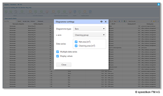
With speedikon® C you can create various chart types such as columns, bars, lines and areas. With the new version next year, scatter charts and stacked columns will also be available. This means you can easily visualize your data in different ways and present it to your colleagues in a concise way.
In addition, you can select a wide variety of criteria on the x-axis of the charts, including building, level or room, as well as features such as net area and much more. This detailed selection allows you to call up the information that is relevant for your analyses.
Exporting charts effortlessly
What’s more, you can not only display several data sets and values in one chart, but also print charts as required or download them in various formats such as PNG, JPG, SVG or PDF. You can then use these files in reports or other software solutions. You can also easily switch between the individual chart types with just one click and display your data in a pie chart instead of a bar chart, for example.
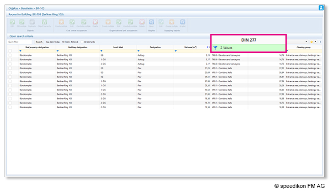
Analyzing data efficiently with column filters
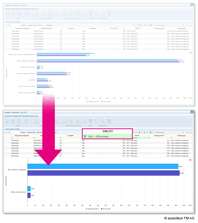
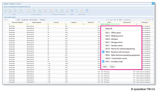
The column filter in speedikon® C changes the way you search for specific data and update your charts. Similar to Excel, you can use the filter icon to search for different criteria. The chart updates automatically without you having to press Enter. The number of active filters is always displayed in the column so that you can keep track of the selected values.
Automatically updating the chart with the selected data sets makes this process seamless and efficient. For example, if you filter by “office”, the charts will automatically update as well, as shown in the image below.
The ability to filter columns specifically without having to configure separate search tabs for each criterion not only saves you significant costs and time, but also provides more precise filtering for your data. You can also select multiple criteria in the same column. This feature is particularly valuable for companies with a large number of data sets as some of our clients manage over 60,000 rooms or 300,000 employees.
Creating favorites
Another advantage of speedikon® C is the ability to save charts and column filters as favorites. These favorites serve as templates that can be reused at any time. This is particularly helpful when preparing charts and column filters for colleagues who do not use speedikon® C in their day-to-day work, but still need the data from the software for their tasks. The saved favorites can be named as desired and applied with just one click.
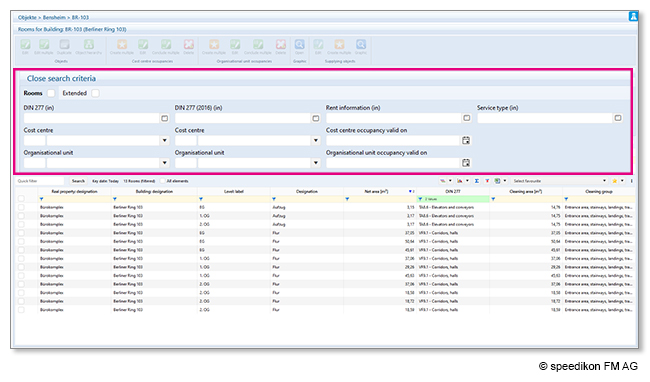
You can use the extended column configuration card to activate additional search criteria, for example DIN, cost center, rentability and many more. The search criteria can of course be individually configured according to the needs of your company.
Would you like to find out more about the analyses engine? Then contact us at +49 (0) 6251 584 0 or by email at info@speedikonfm.com – we’re happy to show you how you can visualize and analyze your facility management data with our analyses engine!